A new typeface for a new building
Designing the new 'Spark' typeface
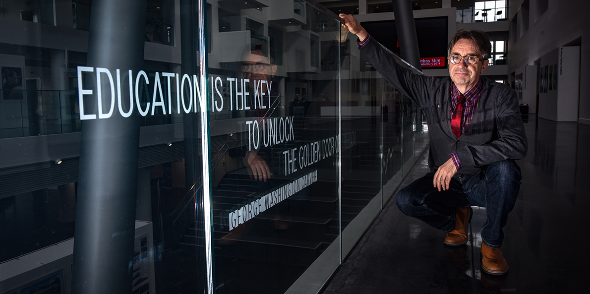
Southampton’s industrial past, Norway’s BT and Nick Long’s dad have all played a part in the design of a new typeface used on inspirational quotes etched into the glass balustrade in the University’s new building, the Spark.
Graphic designer and Programme Group Leader, Nick Long, tells us why he wanted to create a new typeface for the Spark; how he went about it; and what the letter ‘K’ and the building’s Pod legs have in common!
Why did you want to produce work for the new Spark building?
I loved the radical nature of its architecture. It reminded me of Archigram’s – an avant-garde architectural group formed in the 1960s – imagined walking, thinking cities, with a touch of Dan Dare.
A few months prior to starting the project, I’d visited the headquarters of Telenor, Norway’s BT. They had embedded art throughout their new build, not as an add-on, but as part of its structure. It made the companies relationship with the arts crystal clear.
Why did you feel the need to design a new typeface for the project?
The building is unique and bespoke. It seemed fitting this typographic project should try to contain similar qualities. Designing a site-specific typeface seemed a good way of achieving that goal.
What qualities did you want the typeface to contain?

I was lucky enough to meet the architect of the Spark building at the start of the project. He explained how the structure was formed, and how a creative university could make its aims visible, through the environments it constructs.
Corbusier – one of the pioneers of what is now termed modern architecture – talked about buildings being ‘machines for living’, and this building has a very strong machine aesthetic. It can look like an aircraft leaving a hanger, or a ship emerging from a dry dock. These are both apt descriptors of the recent history of the city.
I wanted the typeface to partly reflect the vernacular of Southampton’s machine age. In other words to avoid the carefully contrived ‘designed’ elements seen in most typefaces, and instead look at the purely functional type you find in the cockpit of a Spitfire, or on the bridge of an ocean liner; the foundations that helped create modern Southampton.

How did you design the typeface?
The design process can be as much an emotional journey, as a research-based activity. My father was a teenager in the Royal Navy, when posted to Southampton. He worked on the docks readying the Mulberry floating harbour for transportation to the D-Day landing sites. When I take our graphic design students on a typographic tour of the city, I talk about letter forms on buildings I know he would have walked passed and seen – the logotype on top of Solent Flour Mills, the old road signs within the town walls, the ‘Established’ and ‘Provision Merchants’ typography on St Michaels Street. Some of those notions of time and place formed the aesthetic of the typeface. My father was a builder and we worked together on building sites like the Spark, when I was a teenager. So there was a real resonance during the design and fit stage of this project.
When I was a design student, I was lucky enough to meet the great German type-designer, Hermann Zapf. He called typography, ‘two dimensional architecture’. I took that idea to its illogical conclusion and tried to use the plans of the Spark building to help construct the elements of the individual characters. It’s a tall structure, therefore it’s a condensed typeface. The ‘K’ uses the same angles as the legs of the Pod. The curves of the Pod shaped the ‘O’. And so on. Inevitably you can’t transpose from one form to another without review, or you would end up with a group of ‘characters’ that refuse to coexist.
All new typefaces will have some letterforms that are more challenging to develop than others. As this was an uppercase only design, it meant there were 26 letters I didn’t need to draw. But there were still more than enough of the trickier rounded forms, ‘BDGOS’, to fret over. The ‘G’ was particularly problematic. After countless attempts, I sent one version off to a world renowned type designer for feedback. His emailed response was as incisive and succinct as ever, “Its crap”. Two more iterations were sent similarly; “They’re crap too”. Another week of work, garnered, “That’ll do”. Praise indeed!
And the final outcome?
The choice of the 15 quotes came from our students, and that’s just as it should be, for a building dedicated to education. I also didn’t want the typography to be too intrusive, and etched glass is about as non invasive as you can get. This important building should take precedence over its contents.