news
Art and design
Student recreates iconic Microsoft wallpaper as giant sculpture
One of the most recognisable images in digital history transformed into a large-scale, interactive sculpture
3 June 2026One of the most recognisable images in digital history transformed into a large-scale, interactive sculpture
3 June 2026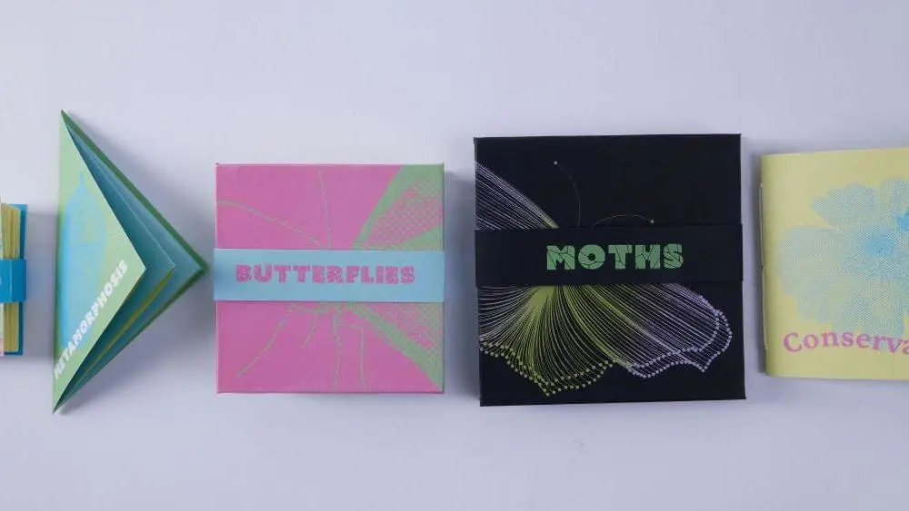
An educational project exploring the science behind butterflies and moths, aimed at engaging teenagers and young adults.
2 June 2026
A Southampton Solent University Computer Science student has turned his passion for financial literacy into a fully functional app.
2 June 2026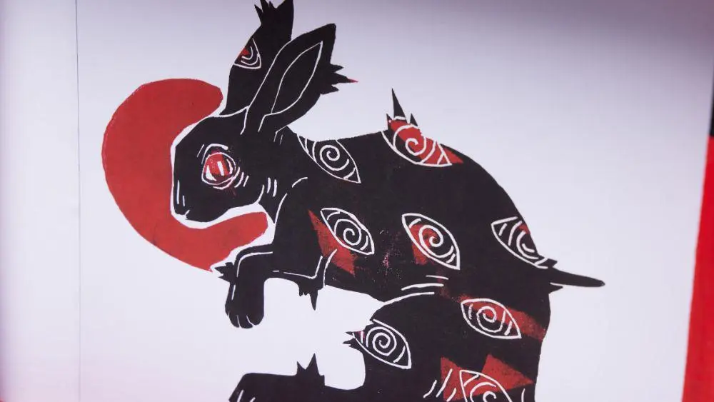
A BA (Hons) Illustration student has taken a step toward his dream of becoming a tattoo artist by creating a hand-built portfolio.
1 June 2026
Southampton Solent University graduate has been honoured at the New Mayor's Ceremony, winning the Young Entrepreneur 2026 award
1 June 2026
From her studies at Southampton Solent University, Shivalika Puri has gone on to cover some of the world's biggest stories.
29 May 2026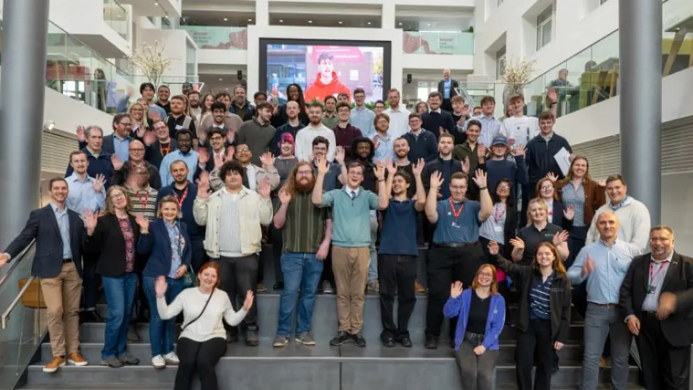
Students presented their final projects to employers, industry advisory board members and sector specialists.
28 May 2026
Leo Wilkinson selected for prestigious Athena Pathway Youth Squad for the Youth America’s Cup
27 May 2026
Solent University’s MSc Logistics Management course has been officially accredited by the Chartered Institute of Procurement and Supply
27 May 2026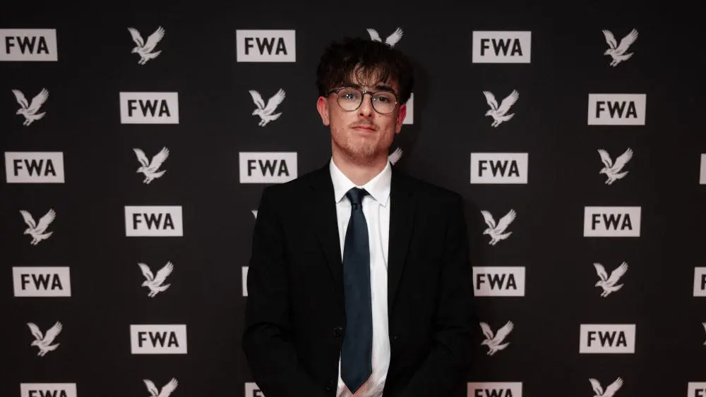
A Southampton Solent University student has won a prestigious national award from the Football Writers’ Association (FWA).
21 May 2026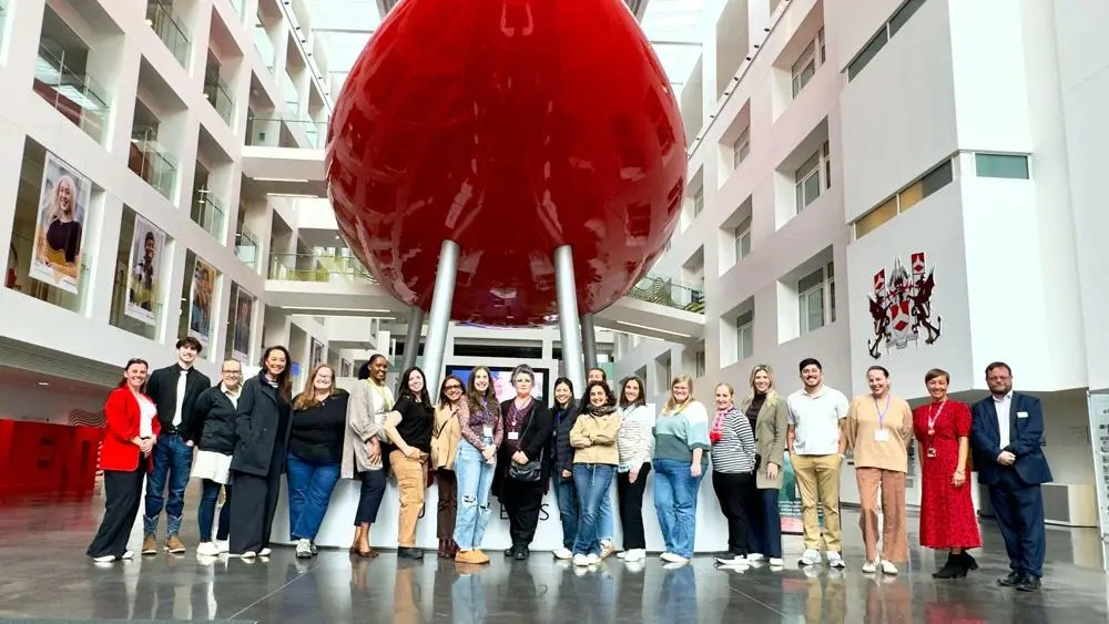
Solent recently welcomed a delegation of US visitors as part of the
19 May 2026
Experience life as a student at Solent at one of our on-campus or virtual undergraduate, postgraduate or maritime open days.
Find out more
Solent graduate contributes to Gorillaz latest album campaign
14 May 2026
BA (Hons) Film Production lecturers gain international recognition at the Cannes Film Festival.
14 May 2026
Solent is enhancing its architecture offer, building on the success of its existing courses
13 May 2026
The Sport Excellence Programme continues to deliver success and Solent cheerleaders are competing on the world stage
12 May 2026